Design

#3 Learning Outcome

UX Overhaul

Iterations

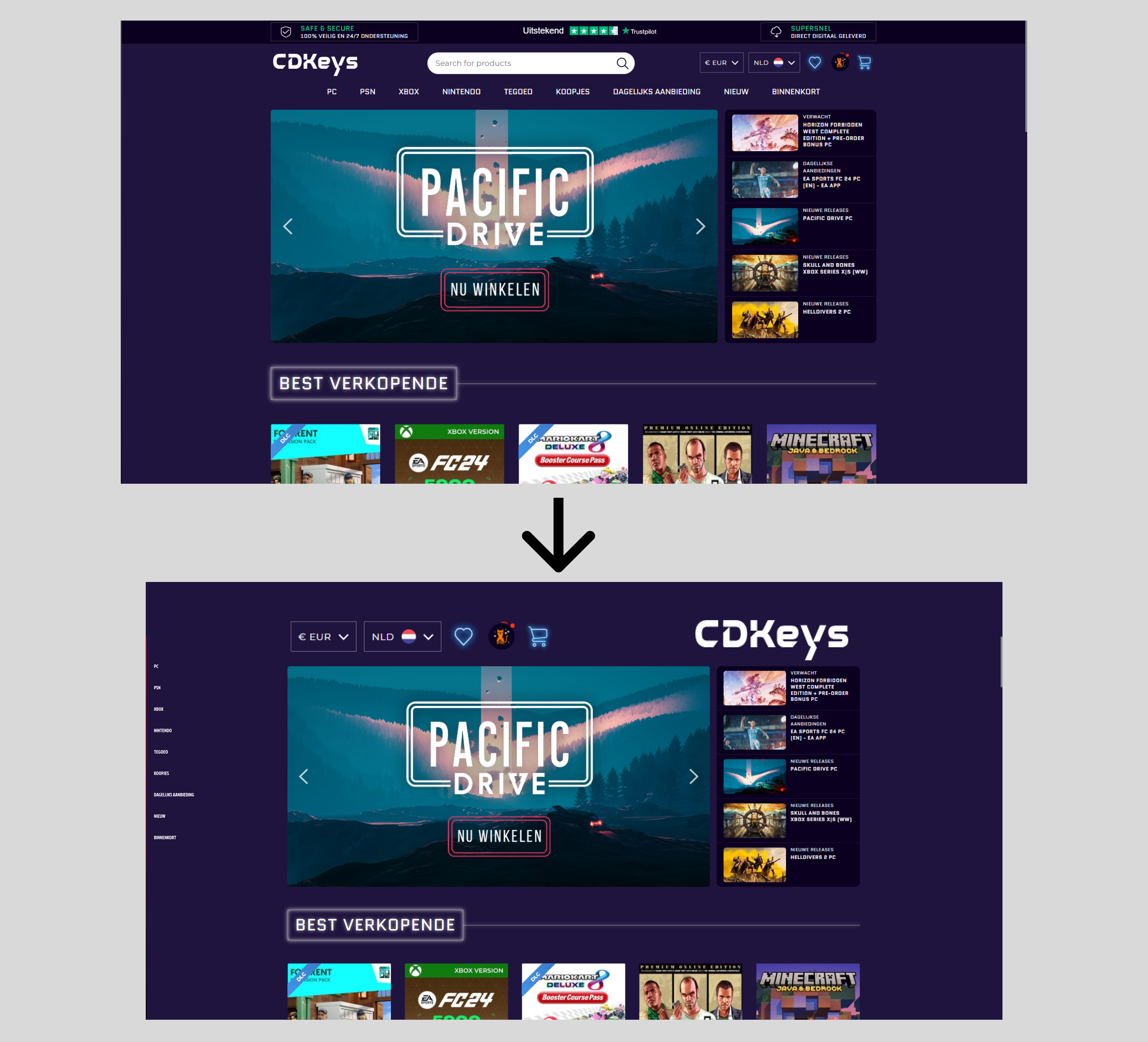
During the introduction week, we had various assignments to complete. One of them was a UX overhaul. Essentially, take a website and make the UX design awful. So what I did was take a gaming website and delete some areas that were necessary, but of course I needed to make it look ugly, so I eliminated them, as well as modifying the sizes of some buttons to make them less apparent and difficult to click.

Stylescapes

Making Iterations

For "Eindhoven Rockcity" our first project we attempted to divide the several tasks we had for the project so that we could finish them in the first week. We began by creating Stylescapes, which I had never done before, and it was interesting to do the research and creation of one. I made my first one after some time, and I was pleased with it. Next, to improve the design and make it more professional, we provided input and made iterations. I created two iterations of my Stylescape.

Recieved Feedback

Teacher: After I showed the first version of my stylescape to my teacher Dirk, he gave me comments that I needed to add additional text and include the code for the color palettes. Students: I received feedback that my graphics and content appeared to be randomly placed and that I needed to make it more clear and ordered.

Merchandise

Iterations of the products

I began working on the prototypes for Eindhoven Rockcity's upcoming merchandise products after we had an idea of what we needed. They already had t-shirts and various patterns that they could utilize, so I started by constructing hoodies. I then made headphones, caps, and mugs. Since they don't have enough income to produce the headphones as a regular product to sell, the aim was to make them as a giveaway.I asked teachers and team members for feedback once I finished the initial iteration of the items. I then began to develop iterations.

Recieved Feedback

Students: I received suggestions that I needed to make the merchandise more visual, rather than just the product with a background and text. I chose to employ real models and apply the merchandise on them to make it more visible and professional.


PDF Document

Flyers

Iterations of the flyers

I started working on the graphics when we had to create a campaign for our second project, which was about Lighttown Speakers. In order to support the event idea I had for the campaign, I started working on a flyer. I have provided a brief description of the event along with a QR code that you can scan to view additional details, as the club educates its members how to present confidently, I have the flyer limited information to give a sneak peek at what's to come.

Recieved Feedback

Teacher: Frank suggested that I include a QR code for further information or a location, as well as adjust the font sizes. Students: After creating my initial iteration of the flyer, I received feedback from my teammates that I needed to change the font to match the website.

Business Card

Iterations

We had to create business cards for the Lighttown speakers to use if they met a new customer or partnered with someone. I decided to take on that assignment and create a cool design that would complement the flyer I had previously created and the website for the ultimate matching set.

Recieved Feedback

Teacher: The input I received was that I needed to adjust the colors on various parts of the business card since they did not match and looked weird. Furthermore, I shouldn't place the main logo on both sides of the card.

Blender - CYBERTRUCK

Adding the final details

I started adding the finishing touches once I finished creating the car. I began by adding the car's rims and working on them. Then, in order to make it appear more realistic, I adjusted a few colors. The trickiest step was then creating the windows' reflections, which I accomplished by using a template.

ProjectX MoodBoard

Creating moodboard

I might argue that I'm not very skilled at creating moodboards, and this was just my second or third, but I needed to create one for Project X. Because I prefer basic designs, I decided to keep it simple and avoid using too many images or text. My concept was to develop a website selling iPhone cases based on the Japanese art that I adore. So I included some photographs of Japanese art that will be displayed on the cases, as well as a color palette of three colors: red, black, and white.

Recieved Feedback

Overall, Dirk liked my moodboard, and his advice was to add more items to it because it was a little empty.

Figma ProjectX

Website prototype

For ProjectX, after creating the website's wireframe, I began creating the actual design. For the website, I chose a simple design with the colors red, white, and black. Following this, I designed the website.

Recieved Feedback

After speaking with Dirk, I realized there are areas that I don't need and can simply cut or replace. And he showed me that I can go outside the box and create intriguing designs for my website.